WEST WITTERING YOUNG EXPLORERS
From notebook scribbles
to a world of wonder.
A nursery brand and website, grown from connection, imagination and a shared belief in something special.
A nurturing nursery in West Wittering
Brand identity, website and words
A little wonder.
A world to discover.
01 / WHERE IT BEGAN
Before the brand,
there was a feeling.
WWYE began with scribbles in a notebook, conversations with Beccy and an idea we cared deeply about. There was passion, there was soul, and there was a picture beginning to form of a place where childhood could be full of curiosity, connection and little adventures.
My part was to listen to that vision and help give it a shape. To find the colours, words and details that would carry its heart into the world, while keeping the person behind it close to every decision.
02 / FINDING ITS FEELING
Rooted in its place.
Alive with possibility.
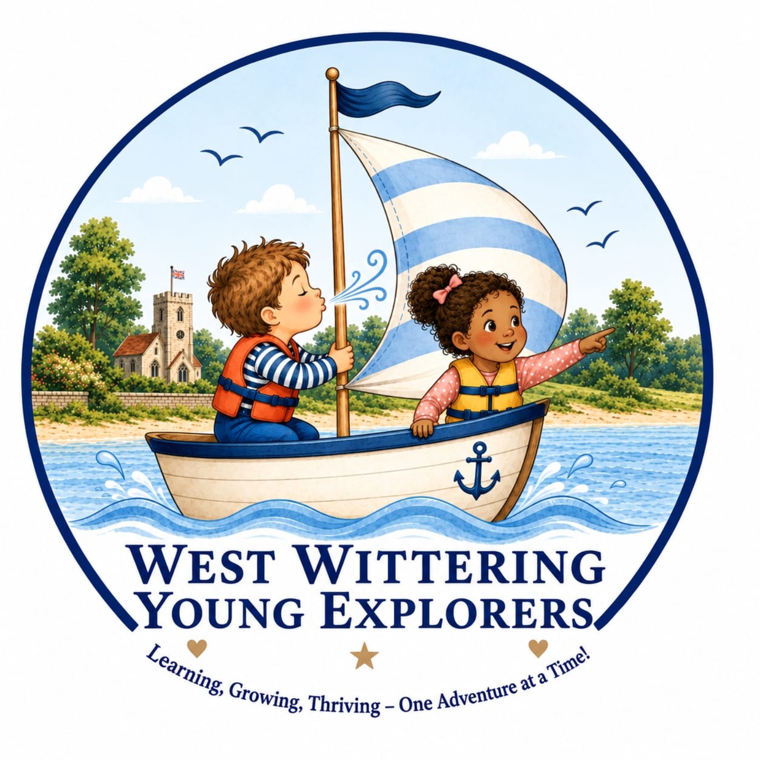
Coastal blues, sandy warmth and touches of green connect the identity to the world around West Wittering. The illustrated sailing boat brings a sense of adventure, with young explorers at the centre of the story.
The words needed to feel just as welcoming: gentle, curious and full of care. A way for families to get a sense of the nursery before beginning a conversation.
THE IDENTITY, BROUGHT TOGETHER
A world of wonder.
One thoughtful identity.
The visual language behind West Wittering Young Explorers: a coastal sense of place, a curious spirit and a warm welcome.
01 / PRIMARY LOGO
Every detail carries a little of the nursery’s story.
- Rooted in its community
- The Wittering church in the background connects the identity to its village and the community surrounding it — a familiar landmark and a sense of belonging.
- A little breath of independence
- The boy blowing into the sail represents the independence children are encouraged to discover. His own breath helps move the boat forward, a playful expression of trying for yourself and finding confidence in what you can do.
- Letting curiosity lead
- The girl pointing into the distance represents the child leading the way. Her curiosity sets the direction, with room to follow her interests and shape adventures of her own.
02 / BRAND ESSENCE
A little wonder.
A world to discover.
A nurturing place for childhood curiosity, meaningful connections and everyday adventures.
A welcoming identity for children and the families who care for them.
03 / COLOUR PALETTE
Coast, sky, sand and garden.
Coastal blue
#123A78Primary · headings & buttons
Open sky
#79B4E3Secondary · playful accents
Sky tint
#DCEFFASupporting · soft panels
Warm cream
#FBF5E8Foundation · backgrounds
Garden green
#718C4BAccent · nature & exploration
Sandy gold
#C99A52Accent · warmth & detail
04 / TYPOGRAPHY
Georgia Headings & storytelling
Aa
Very big
adventures.
A familiar serif with warmth, character and room for wonder.
Arial Body copy & practical details
Aa
Small discoveries.
Meaningful moments.
Clear, approachable words that make information easy to find and read.
05 / IMAGERY & ATMOSPHERE
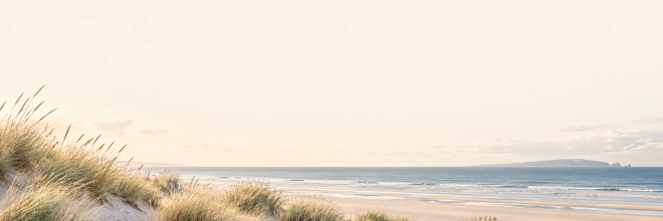
Natural light, earthy textures and a sense of place. Imagery makes room for curiosity and the little details of childhood.
06 / ILLUSTRATION & DETAILS
Coastal grasses, a little sailing boat and gentle lines connect the identity to its surroundings. These details carry through to the website’s footer.
07 / TONE OF VOICE
Warm. Curious. Reassuring.
“A cosy base for very big adventures.”
Gentle invitations and imaginative language, balanced with clear information for parents.
03 / BRINGING IT TOGETHER
A place to explore.
A welcome to feel.
The website brings the identity and the story together, giving families room to explore the nursery’s approach, picture the rhythm of a day and discover the adventures beyond its doors.
Alongside that feeling, there is a practical purpose: clear routes to parent information, answers to everyday questions and a simple way to get in touch. Thoughtful design should make the next step feel easier.
Explore West Wittering Young Explorers (opens in a new tab)FROM ONE BEGINNING TO ANOTHER
Your idea has
a story waiting.
You do not need to have it all worked out. Bring the scribbles, the hopes and the feeling you keep coming back to.
Let’s bring it to life